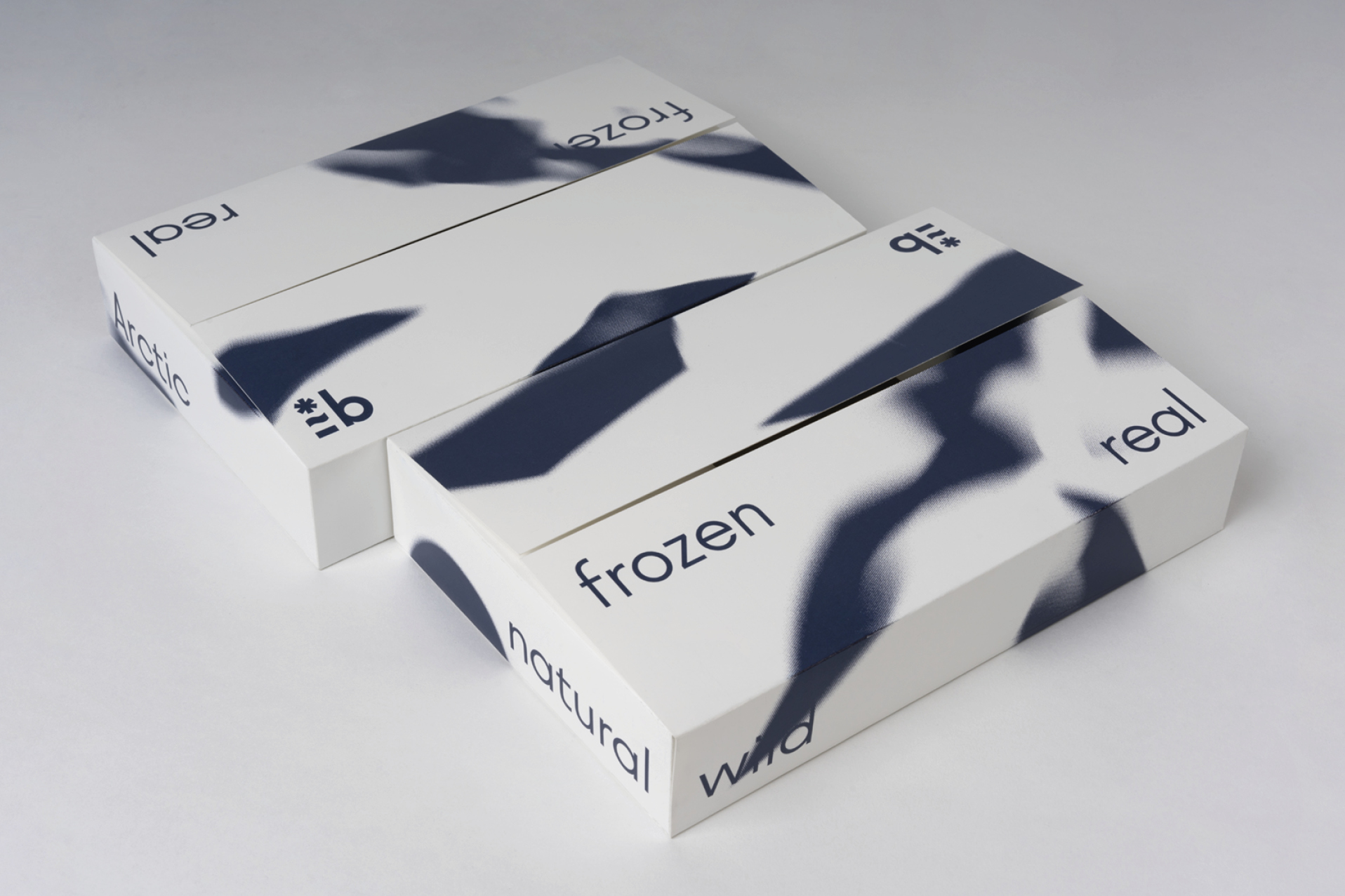
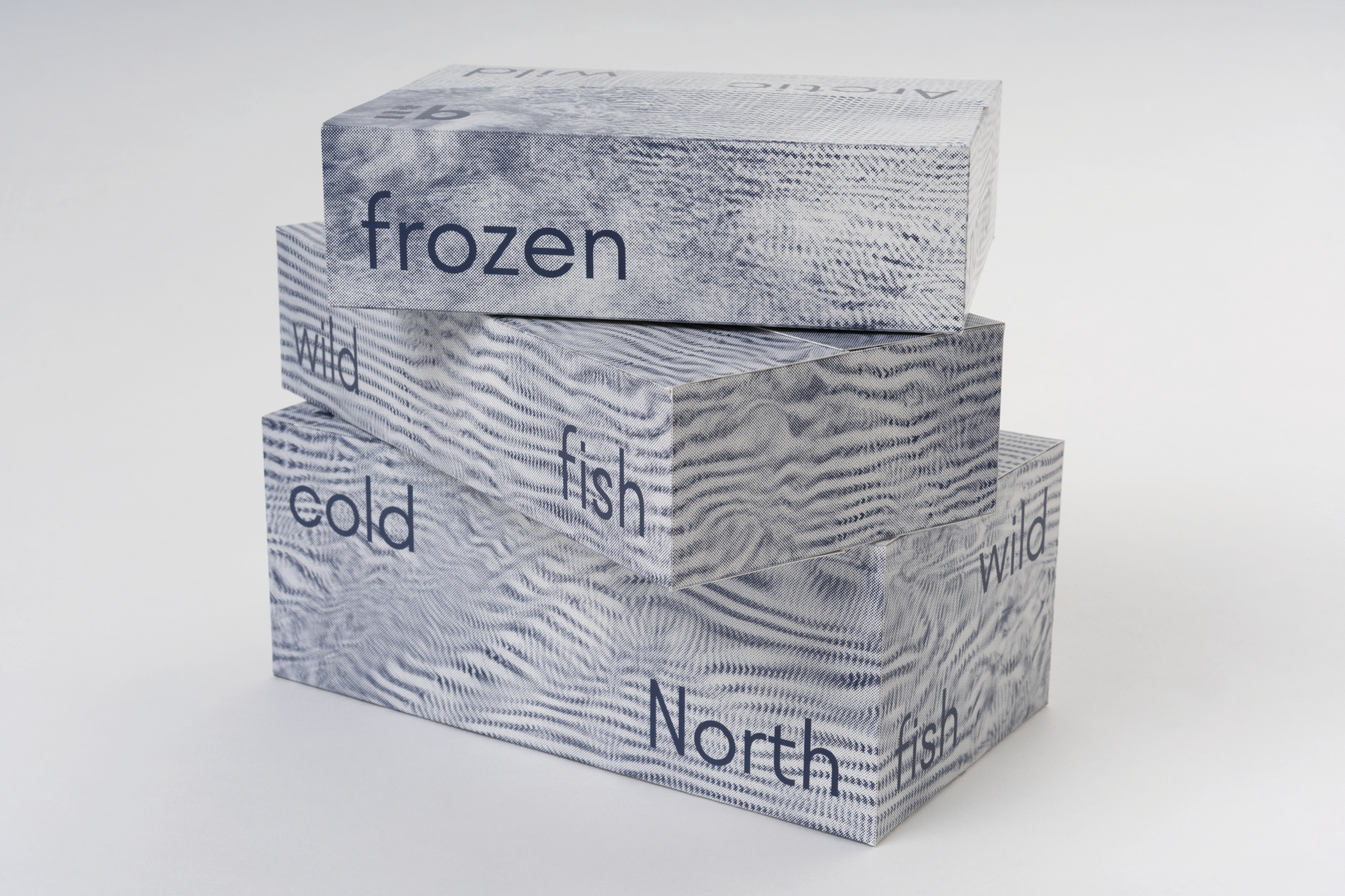
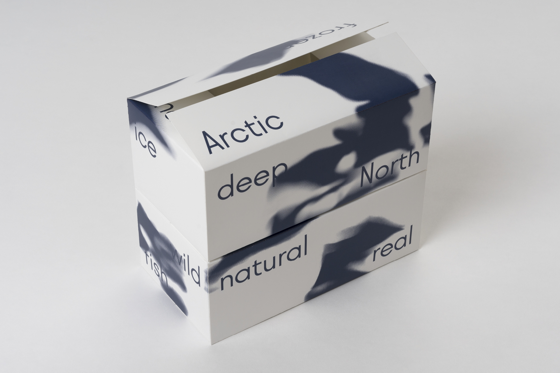
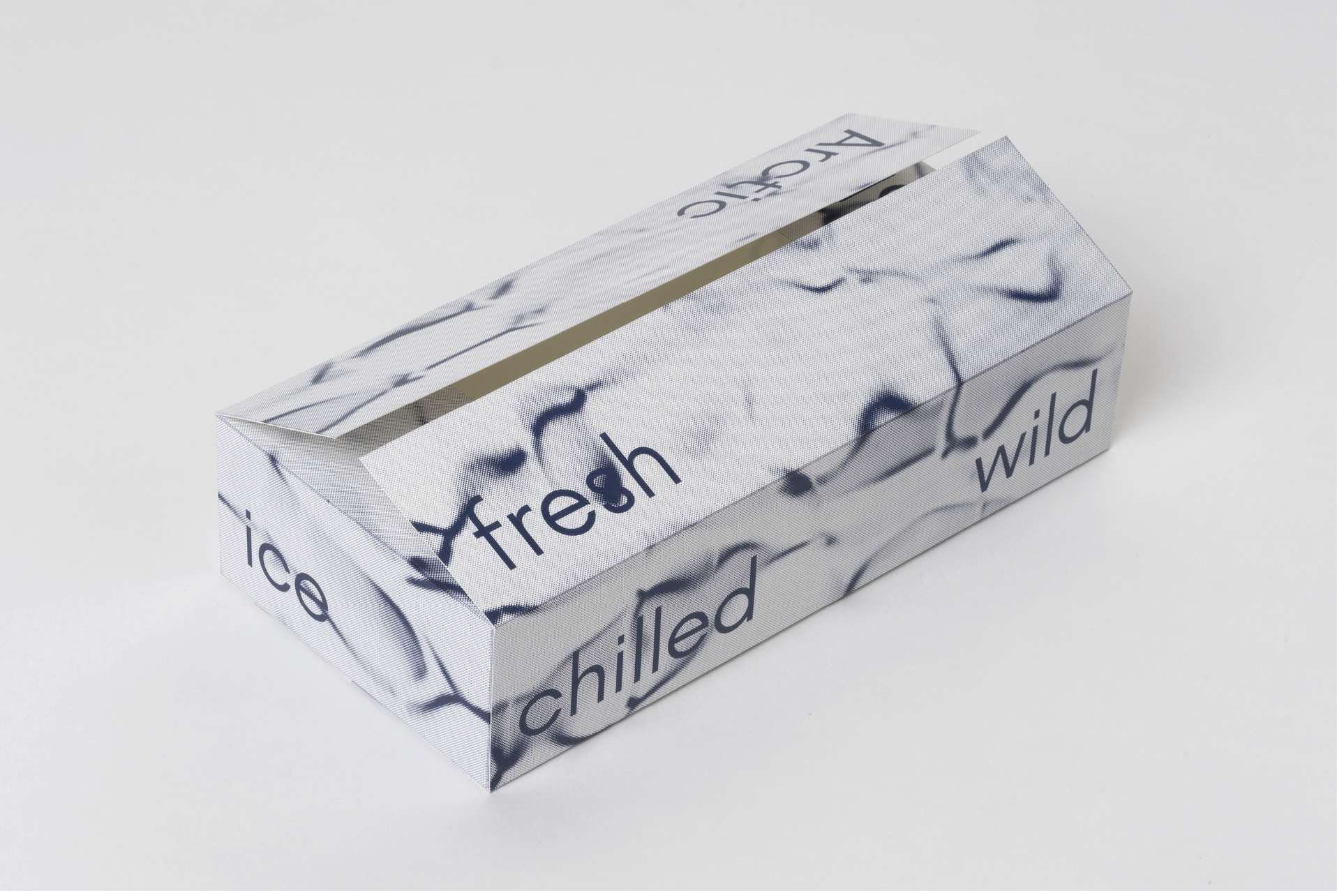
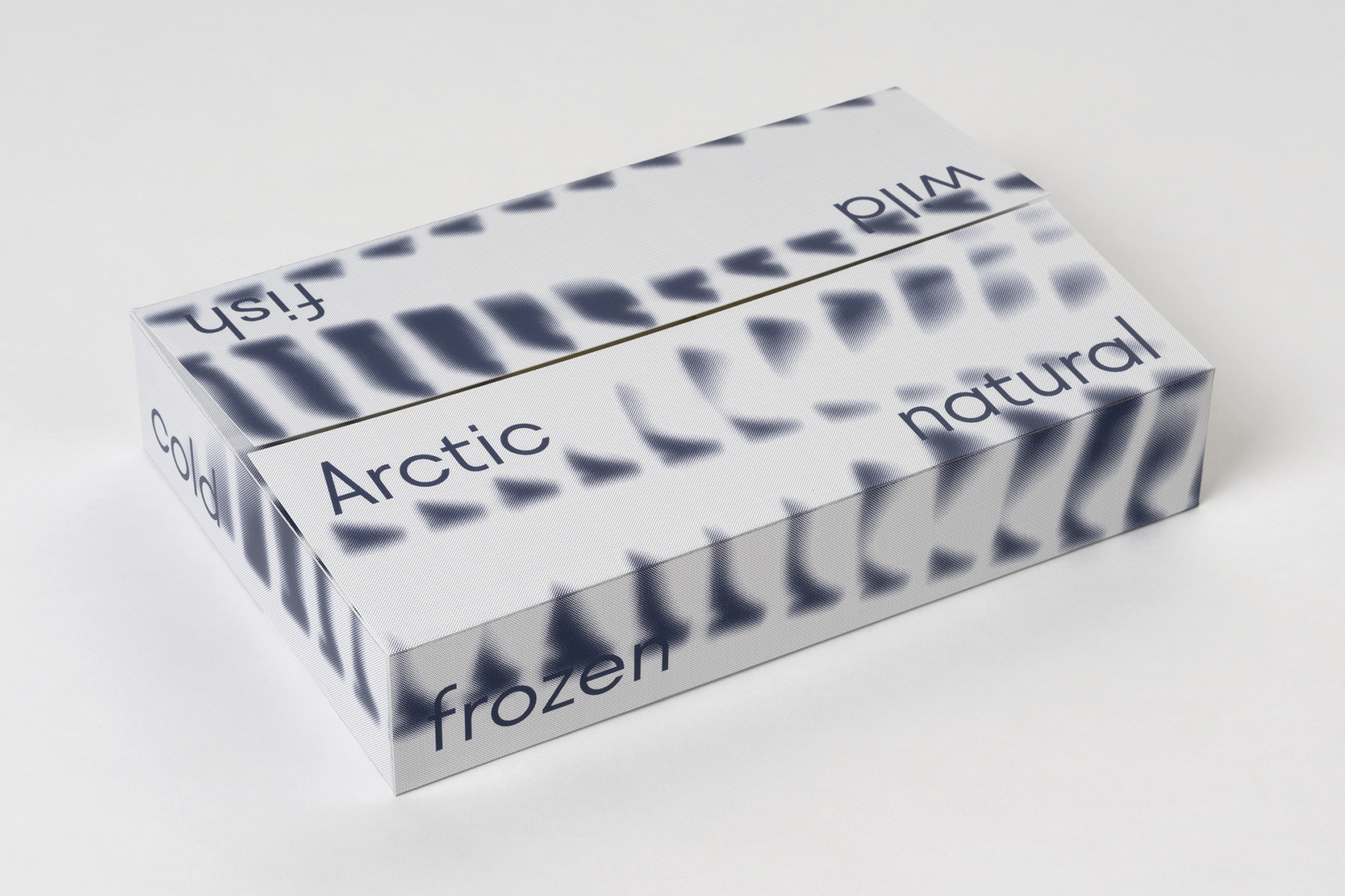
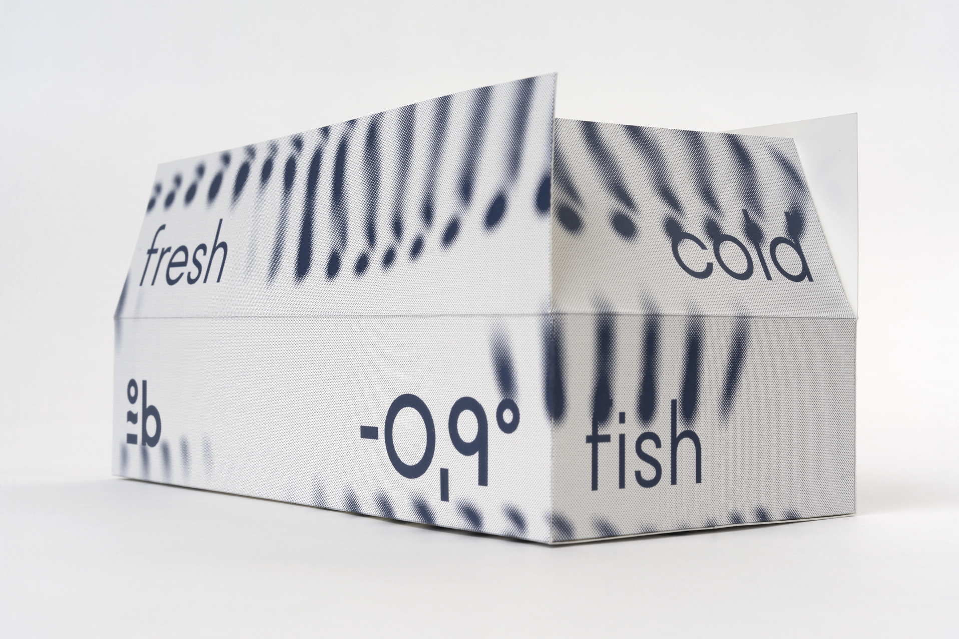
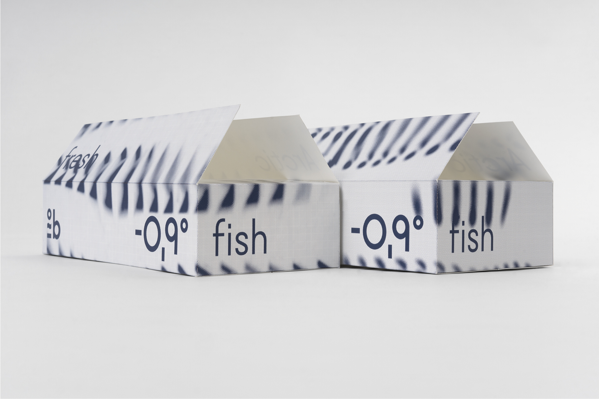
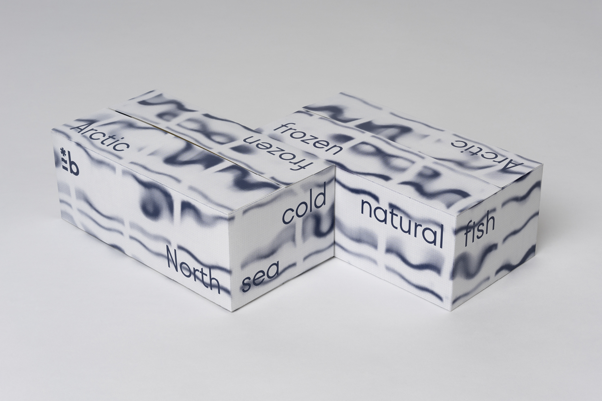
This is a design of transport packaging - it's a part of a complex branding project - Borealis.
Borealis (from Latin: northern, cold) is a packaging project for wild deep-sea fish. Borealis is a retail brand from Norebo – a leading fishing company in Russia, that owns a trawl fleet and does fishing in the northern seas.
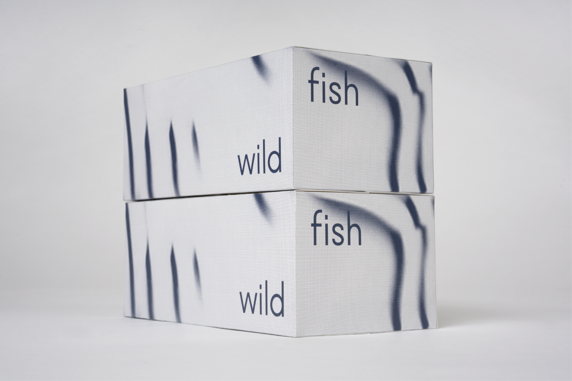
The core of identity is reflecting the product itself – wild, northern, deep-sea fish. The product line includes 9 types of fish, each of them has its own unique features. We have researched all types of fish and developed a visual system that shows recognizable visual and behaviour elements of every fish. We’ve created original typeface with alternative set that is linked with individual features of the fish. For example, for cod, such a feature is a chin barbel, which could be seen in the letters of the title and in the fish sign as well. Every type of fish in the product line has the personal sign, the logo, unique graphics and the colour.
Experimental approach and nature have helped us to make it alive to show that fish is really wild. We have placed signs and graphics under the sea water, to let the nature add the final touch to the design. We were surprised that nature gives us a variety of abstract graphics, which everyone can find their own association. The fish sign becomes alive and graphics start to look like the sea element, wild nature, aurora borealis, fish skin, ice, waves and so on.
Thus we’ve created identity that helps to feel the wild north.
Project elements:
Creative Director:
Designer: